In today’s time, User Interface (UI) can be the difference between a satisfied user and a frustrated one. In fact, a good UI can significantly boost sales and increase overall profits. A good UI design is almost invisible, allowing users to interact seamlessly with the product. But a poor design stands out in all the wrong ways, often driving users away. Thus, it’s essential to follow core principles of design when creating a user interface that focuses on the user experience.
Design principles are the guidelines that help designers create effective and usable interfaces. These principles are the foundation of good design. They influence how users interact with a product. By adhering to these principles, designers ensure that the interface is not only functional but also intuitive and easy to use.
All these principles help user achieve their goal efficiently, thus giving them a positive user experience.
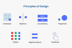
For design principles, there is no universal agreement on the exact number. Some sources list seven core principles, while others include up to fourteen. For this guide, we’ll focus on ten fundamental principles of design in UI/UX for user experience. Let’s explore each of these core design principles in detail.
1. Emphasis
Emphasis is the design technique used to highlight specific elements in an interface. It guides the user’s attention to what’s most important. This makes it easier for users to navigate and interact with the design.
Emphasis makes certain elements stand out, such as buttons, headlines, or key images, so users can quickly identify what’s important.
You can use multiple techniques to achieve emphasis. Using larger elements naturally draws more attention, while bold and contrasting colors make elements stand out. Positioning elements in key areas, like the top or center of the screen, can also emphasize them. Additionally, contrast highlights specific areas by creating a noticeable difference between elements.
2. Balance & Alignment

Balance in design refers to how visual elements are distributed across the page to create stability. Imagine a seesaw—if too much weight is placed on one side, it tilts and becomes unstable. In design, balance makes sure that no part of the design feels tilted to one side.
You can use either symmetry or asymmetry to create a balanced design. Symmetrical balance involves placing elements evenly on both sides of the design. Whereas, asymmetrical balance creates a visually interesting layout by using uneven distribution.
Additionally, Alignment plays a key role in maintaining balance by positioning elements along a grid or axis. Proper alignment establishes order and also makes the interface easier to navigate.
3. Proportion & Hierarchy

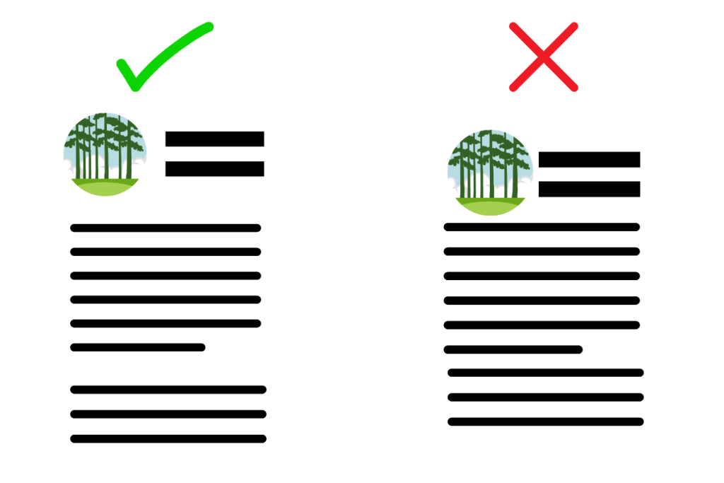
Proportion refers to the size relationships between elements in a design. It ensures that elements are visually balanced and in proper relation to each other. For example, larger elements draw more attention in comparison to smaller elements. By maintaining proper proportion, you create a design that feels visually comfortable. If all elements are the same size, it can create confusion. However, varying sizes guide the user’s attention to what’s most important.
Hierarchy works hand in hand with proportion by organizing elements in a way that reflects their importance. Hierarchy guides the user’s eye to the most crucial elements first, such as headlines or calls to action. It then moves down to less critical content. This is achieved through the use of size, color, contrast, and placement. A strong visual hierarchy helps users quickly navigate and understand the structure of the content.
4. Consistency
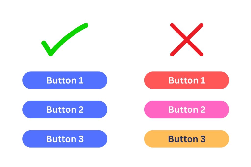
Consistency in design ensures a uniform and cohesive experience across the entire interface. It ensures that all elements like colors, fonts, buttons, and layouts behave in a predictable way. This familiarity makes navigation easier and enhances usability for the user. For example, using the same font style and size for product names throughout the website creates a uniform reading experience. It ensures users don’t have to adjust to different text formats on each page.
You can use repetition to achieve consistency. By repeating visual elements like color schemes, fonts, and button styles across different sections, you reinforce the design’s identity and structure. This creates a sense of unity and helps users instinctively know how to interact with the interface.
5. Clarity
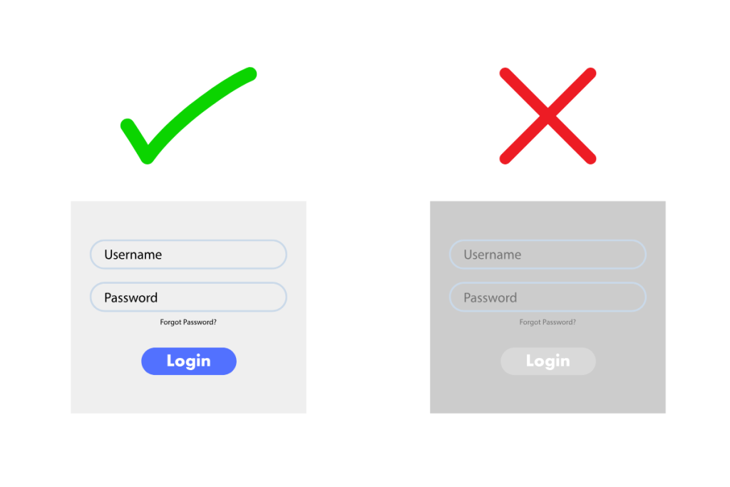
Clarity in design ensures that all elements of the interface are easy to understand and behave as expected. It makes the interface straightforward, so users can take the necessary actions without confusion.
It involves clearly communicating through visual elements like labels. buttons, icons, and text. They should be obvious and self-explanatory, guiding the user smoothly through the interface. Avoiding unnecessary distractions and maintaining simplicity makes up a clear design. For example, a well-labeled button and icon that align with the user’s expectations improve overall usability.
6. Usability & Accessibility
Usability ensures that an interface is easy and efficient for users to navigate. It focuses on streamlining user experience with simplicity, clear instructions, and intuitive design. It allows users to complete tasks with minimal effort or confusion.
Accessibility, on the other hand, ensures that the interface is usable by people with a wide range of abilities and disabilities. This includes supporting features like screen readers for the visually impaired, high contrast for better readability, and keyboard navigation for users with motor impairments. Designing with accessibility in mind ensures that all users, regardless of their abilities, can interact with the interface and complete tasks easily and effectively.
7. Feedback
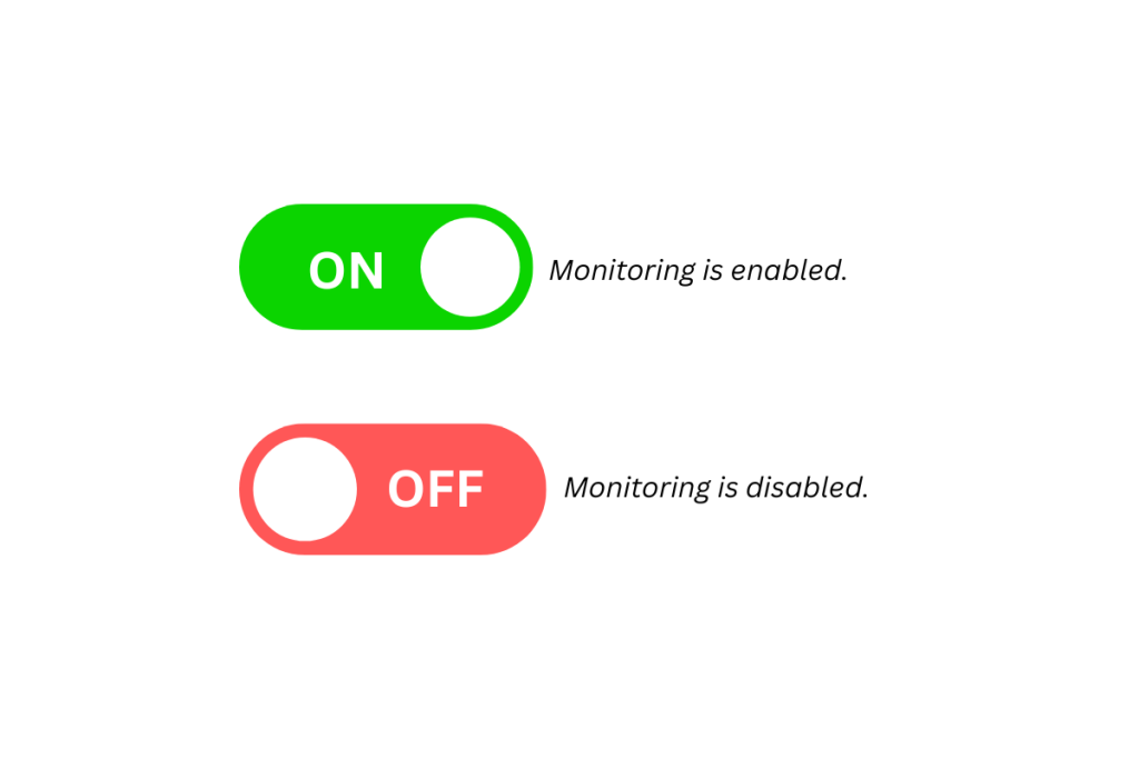
Feedback in design refers to the information provided to users about their actions or system status. Clear feedback enables the user to know the result of their interaction with the design. It makes them feel confident in their interaction and reduces the uncertainty. Feedback can be in the form of visual cues, sounds, or messages, helping users feel in control and confident during interaction.
Having proper feedback message also helps in error prevention as the user are guided with proper response on each of their action. By guiding users through feedbacks, you can reduce frustration to the user and prevent potential error.
8. Negative Space (White Space)
Negative Space (White Space) is the empty area around and between elements in a design. It is used in an design to enhance readability, reduce clutter, and create a balanced, visually appealing layout. It provides breathing room for content, making it easier for users to focus on key elements without feeling overwhelmed.
Effective use of negative space improves navigation and highlights important information. It contributes to a clean, modern interface that enhances the overall user experience.
9. Affordance
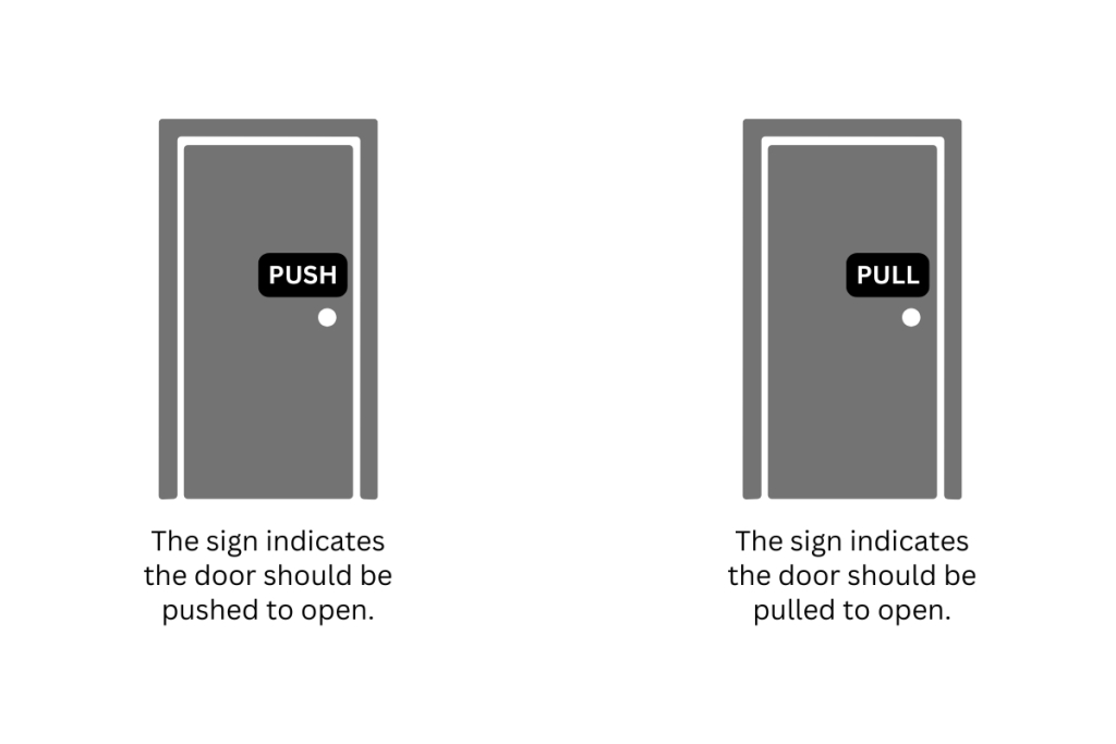
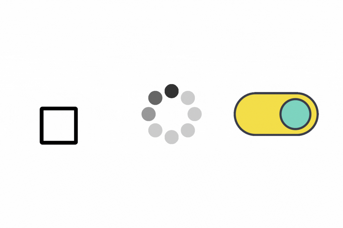
Affordance refers to the visual clues in design that suggest how an object or element should be used. The visual element with affordance can give a hint about its function and purpose, making it clear to the user how to interact with it.
For example, a button with a shadow signals that it can be clicked, while a slider with a draggable handle naturally suggests movement. Well-designed affordances reduce the need for instructions, enhancing usability and user experience.
It helps a user to understand an element’s purpose and interaction possibilities at a glance.
10. Pattern

Pattern in design refers to the consistent use of recurring elements, layouts, or structures. It enhances usability by creating familiarity. Design patterns help users quickly understand how to interact with an interface. It reduces cognitive load and improves the overall experience.
For example, the placement of a navigation bar at the top or side of a webpage is a widely recognized pattern that makes browsing intuitive. Similarly, common button styles, form field arrangements, and card-based layouts in apps and websites follow established patterns, ensuring consistency and ease of use.
Conclusion
These principles of design are essential for creating interfaces that are intuitive, easy to use to the user. Designers can use these principles to create a product with seamless positive user experience.
Whether you’re designing a website, mobile app, or software interface, understanding and applying these principles will help you build more effective, user-friendly products. If you want to learn how we naturally interpret designs, check out Gestalt principles of design.
Start incorporating these principles in your next project, and see how they improve the user experience and satisfaction!